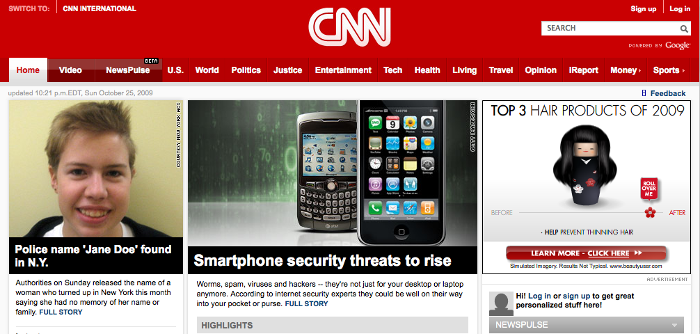
CNN’s 2009 Home Page Redesign
 Looks like the people over at the CNN’s Web Design teams have been busy. I think I need a bit of time to digest and get used to the new design before I can say if it’s a real improvement, but first impressions are also important:
- a bit jarring visually compared to the previous design/template — felt very RED and a bit heavier.
- I kinda wish they could have taken the new design across the entire site (minor criticism)
- looks like there’s more emphasis on media visuals. Video especially feels like it has more prominence.
- homepage gets a little bare below the fold.
- news pulse feature is great. It’s basically CNN’s flavor of Digg, but with ‘popularity'(???) driving the rankings.
- better integration of social features. comments are nice (why no facebook connect?), more prominent linking to facebook, twitter, & others, nicer iReport, and again NewsPulse is great.
Overall, I think CNN.com has a cool new design. CNN is setting the bar in the online space for news and media companies by proving their users with a very clean, slick look and feel, adding lots of great new features, and emphasizing their strengths in multimedia and social media. Sure there’s the whole issue of creating more serious revenue from these ‘sites’, but I think CNN’s strategy is to simply grow an audience first by concentrating on user experience… and the money will eventually follow (right, facebook?).
